Old UI was 100x better
-
Can we please return to the Old UI, where all the charts were on one page?
New UI is super frustrating, slows down each analysis.
Don't change what is working. -
This post is deleted!
-
Maybe this can inspire you.
https://x.com/0xdesigner/status/1920912522296651839Keep things simple.
- 1 page
- Keep all the charts on the same page (the previous UI was incredible)
- You can still blur some charts with a call to action to get Premium
- You can still compare OR switch between BTC treasury companies.
This requires little change (because you had it previously) and will 100x the value of your product.
-
Hi Frederic,
Thank you for your feedback!
Just to make sure I understand, is the main concern not having all charts on one page?
What do you think of a multiselect dropdown instead that saves your chart selections and displays them all on one page?
We had limited insight into how people were using the product or what was working and what wasn’t until we enabled the forum and feedback features. Some trial and error is to be expected.
Best,
Radu -
Yes. The main concern is not having all the charts on one page.
Keeping all charts on one page has much additional value and selling potential.The UX is so cumbersome to click to select another chart every time.
It requires too much time and brain power.
Click dropdown >> scroll down >> read titles >> Understand which chart you were looking for. (Bad UX)Also, it doesn't immediately give a glimpse of all the value that your chart offers. (I will leave your website before I know of all the valuable charts you have.)
For upselling, instead of blurring a full chart. Just blur the last 1-2 months, with a call to action for premium in the middle of the blur.
Show Value >> Create pain >> Sell the pain.
(See screenshot example of Santiment)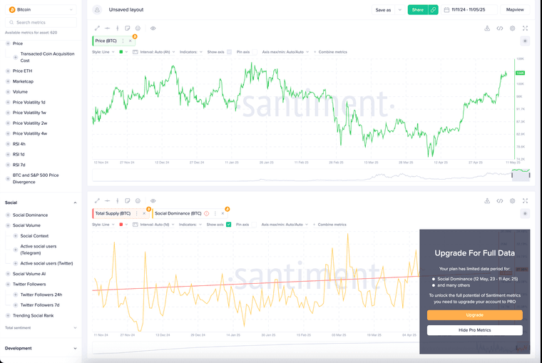
On top of your old design, there are so many cool improvements you can make.
- You could go the custom-built Santiment route (although I think that's not the highest priority)
- Make sure all charts are lined up cleanly. So you can quickly scroll up and down, build ideas and understanding between graphs (and all time frames align vertically)
- Premium users, you could let them put the charts in the order they like. OR you could let them save their last analysis (companies selected)
-
In your original UI. I also liked how you could hide away the cards on the top of the page.
What I didn't like about the old design was that I had to hide the cards every time I visited your website.
That said, in the new UI, the font is too large, the cards are in two rows, the UI is not good, and you can't hide them.
It's a very frustrating experience.UI frustrations.
- 4 cards on one row and the 5th card on the next row. Doesn't make sense.
You could make the cards smaller and put them all on one row.
You could make it 3 first row, 2 second row, centered in the middle.- Make sure all the cards are visible without needing to scroll down to see the 5th card. Right now, you can't see all the cards without doing some scroll action, which kills a sense of overview.
- Many people will give up right there and then, missing out on the charts you have. (On top of this, even if they get to the chart, now it only shows one chart; if that chart doesn't fit their needs, they will leave your website).
- Could we allow the user to hide the cards again?
- Could we have them hidden by default? (or only show the most relevant data, instead of too much data)
- Could we bring better sizing and symmetry to the cards?
- Could we ensure that all the cards are seen at once? (certainly, if the amount of cards is less than 8 or 10)
-
- Added ability to see multiple charts on one page, as well as preserving a user's settings across sessions.
- Added ability to hide/show metric cards.
One thing to point out is that the metric cards would fit in one row if given enough width (or if you zoom out enough)
-
Thank you for the fast improvement.
I hear your point about the metric cards.
It's resolved, setting my Chrome to 90%.However, I have a MacBook with a 15-inch screen. The screen is big enough (acceptable standard) to deserve an optimal default experience (zoom 100% in Chrome).
I'm okay to disagree on this point
")
Thanks again for the quick fix.
-
 R radu locked this topic