← Back to StrategyTracker
Skip to content
  • Categories
  • Recent
  • Tags
  • Popular
  • World
  • Users
  • Groups
Skins
  • Light
  • Cerulean
  • Cosmo
  • Flatly
  • Journal
  • Litera
  • Lumen
  • Lux
  • Materia
  • Minty
  • Morph
  • Pulse
  • Sandstone
  • Simplex
  • Sketchy
  • Spacelab
  • United
  • Yeti
  • Zephyr
  • Dark
  • Cyborg
  • Darkly
  • Quartz
  • Slate
  • Solar
  • Superhero
  • Vapor

  • Default (Yeti)
  • No Skin
Collapse
Brand Logo

Strategy Tracker | Forum

fredericvcF

fredericvc

@fredericvc
About
Posts
19
Topics
10
Shares
0
Groups
0
Followers
0
Following
0

Posts

Recent Best Controversial

  • [MTPL] The mNAV in the Compare dashboard is different from the company specific dashboard
    fredericvcF fredericvc

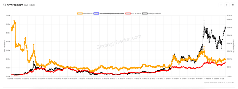
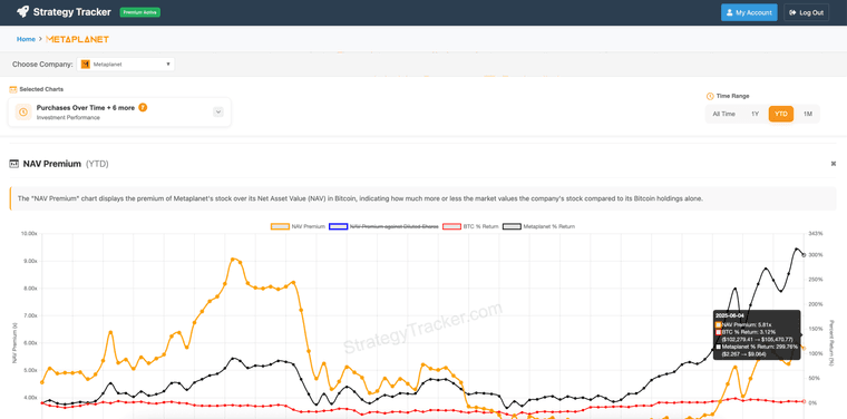
    I think the MTPL specific dashboard is more correct.

    5e219f52-4fe9-4fa4-9f3c-7ffba1abd9bd-image.png

    167bedf5-f6b6-42b1-95aa-3a63ae9b7061-image.png

    Comments & Feedback

  • Improve MultiChart UI by fixing the Chart selector after scrolling down
    fredericvcF fredericvc

    Thanks for the improvement!

    Now I realize that on mobile that leaves only a half screen available for charts. 😅

    Ideas
    1/ upon scrolling down the banners disappears, when scrolling up the banners reappear (in scroll fashion) before the main page (with the charts) scrolls up
    2/ smaller fonts, smaller drop downs

    Comments & Feedback

  • Data Quality MetaPlanet
    fredericvcF fredericvc

    3c9b3848-1983-476f-889d-ac4426ecdb99-image.png

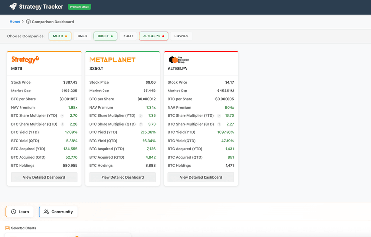
    I think your data is not accurate.

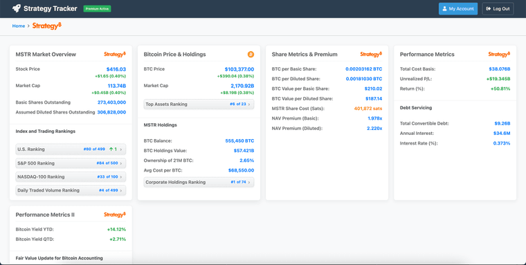
    A quick check with the official metaplanet website reveals outstanding shares of 553M. This doesn't match your data. https://metaplanet.jp/en/analytics

    However, not throwing any shade. It's not easy to get that data I suppose. (I'm still searching for a good source OR a way to calculate it accurately.

    Looking forward hearing your thoughts or potential improvements.

    Comments & Feedback resolved

  • Could we add BTC price change to the Compare tool?
    fredericvcF fredericvc

    f00b23da-780b-4112-8775-836c05197095-image.png

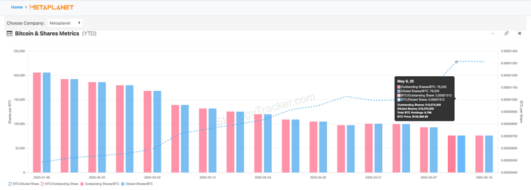
    Would it be possible to add BTC as well?

    Comments & Feedback

  • Could we add the "Months to cover mNAV"?
    fredericvcF fredericvc

    Columns P (since inception) and S (since last bear market low) are the most insightful.

    Comments & Feedback

  • Could we add the "Months to cover mNAV"?
    fredericvcF fredericvc

    I have tested the numbers quite decently.
    I created you an editable copy.

    https://docs.google.com/spreadsheets/d/1aSVCvnQaS9SenovdCYlSOeiaGKf3eK7uMBoJvs8cPZ8/edit?gid=1189116072#gid=1189116072

    Comments & Feedback

  • Can we get the PE ratio back?
    fredericvcF fredericvc

    8988d3fe-e186-4d5c-bcd8-994a9ba44f08-image.png

    I think we were able to see the PE ratio on this chart previously.
    Is that something you would be willing to show again? Maybe by default crossed through?

    Comments & Feedback

  • Invoice after billing.
    fredericvcF fredericvc

    Thanks for improving the service!

    Comments & Feedback resolved

  • Could we add the "Months to cover mNAV"?
    fredericvcF fredericvc

    "months to cover mNAV" is a new metric within the X community to compare multiple BTC treasury companies.

    01691d7d-c46d-41e5-a029-dd939b0e9d0a-image.png

    I did a lot of testing, and this is the right formula to calculate it.

    I think you could make rolling charts.

    • 3 months
    • 6 months
    • 12 months
    • since last bear market >> This one is the most relevant if you want to compare multiple companies.
    • since inception (first BTC acquisition) >> This one is most relevant long term, but Strategy has no competition here yet.
    Comments & Feedback

  • Improve MultiChart UI by fixing the Chart selector after scrolling down
    fredericvcF fredericvc

    https://www.loom.com/share/9191847250f249faa3c084c33f4f200e?sid=7b1c78b1-8db7-45a5-bd87-18381a4fcf78

    Comments & Feedback

  • Invoice after billing.
    fredericvcF fredericvc

    Is there a way that I can get an invoice?

    Comments & Feedback resolved

  • Can we have the MetaPlanet price (in USD)?
    fredericvcF fredericvc

    e2e37dc5-2ead-4e7c-bceb-8cf28b25f2d0-image.png

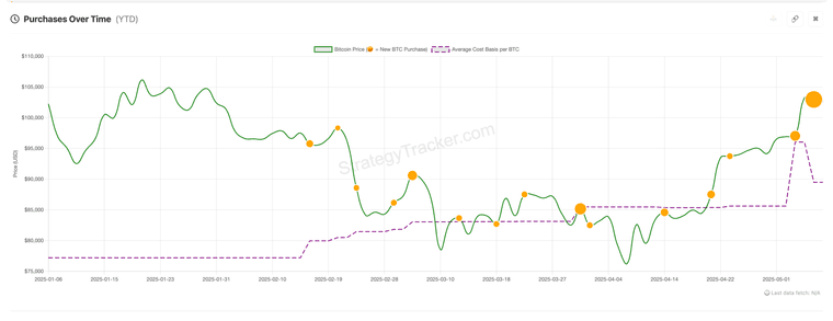
    It would be valuable to have the MetaPlanet price (in USD) on this chart. (or on another one if you prefer)

    Comments & Feedback resolved

  • Loving the single page with all the charts.
    fredericvcF fredericvc

    ab16a144-1c27-4ba9-a10f-c4cd4fa9360a-image.png

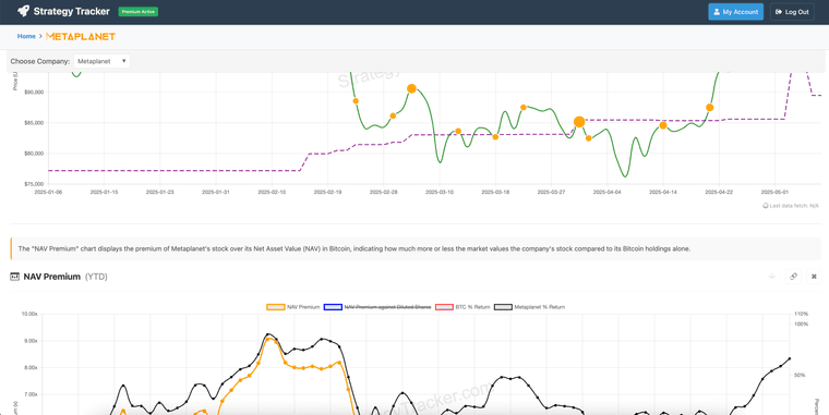
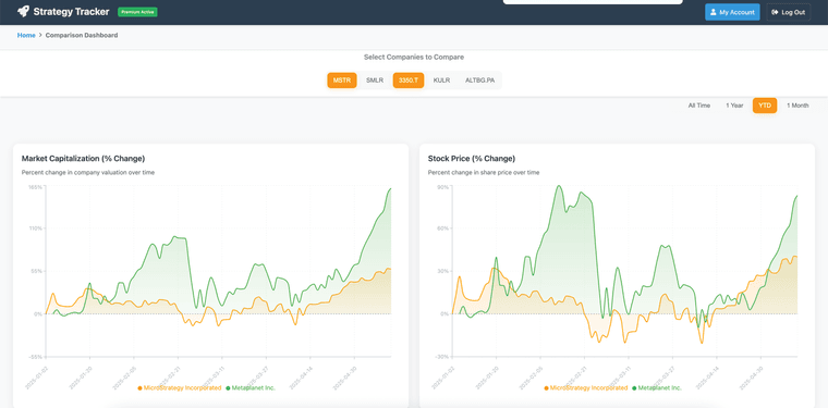
    Now I can quickly scroll between charts and see how chart 2 is impacted (or not) by a BTC buy at the same time.

    🙌🏻

    Comments & Feedback

  • Old UI was 100x better
    fredericvcF fredericvc

    Thank you for the fast improvement.

    I hear your point about the metric cards.
    It's resolved, setting my Chrome to 90%.

    However, I have a MacBook with a 15-inch screen. The screen is big enough (acceptable standard) to deserve an optimal default experience (zoom 100% in Chrome).

    I'm okay to disagree on this point 😉

    Thanks again for the quick fix.

    Comments & Feedback resolved

  • Old UI was 100x better
    fredericvcF fredericvc

    In your original UI. I also liked how you could hide away the cards on the top of the page.
    What I didn't like about the old design was that I had to hide the cards every time I visited your website.
    That said, in the new UI, the font is too large, the cards are in two rows, the UI is not good, and you can't hide them.
    It's a very frustrating experience.

    UI frustrations.

    • 4 cards on one row and the 5th card on the next row. Doesn't make sense.

    You could make the cards smaller and put them all on one row.
    You could make it 3 first row, 2 second row, centered in the middle.

    • Make sure all the cards are visible without needing to scroll down to see the 5th card. Right now, you can't see all the cards without doing some scroll action, which kills a sense of overview.
    • Many people will give up right there and then, missing out on the charts you have. (On top of this, even if they get to the chart, now it only shows one chart; if that chart doesn't fit their needs, they will leave your website).

    image.png

    1. Could we allow the user to hide the cards again?
    2. Could we have them hidden by default? (or only show the most relevant data, instead of too much data)
    3. Could we bring better sizing and symmetry to the cards?
    4. Could we ensure that all the cards are seen at once? (certainly, if the amount of cards is less than 8 or 10)
    Comments & Feedback resolved

  • Old UI was 100x better
    fredericvcF fredericvc

    Yes. The main concern is not having all the charts on one page.
    Keeping all charts on one page has much additional value and selling potential.

    The UX is so cumbersome to click to select another chart every time.
    It requires too much time and brain power.
    Click dropdown >> scroll down >> read titles >> Understand which chart you were looking for. (Bad UX)

    Also, it doesn't immediately give a glimpse of all the value that your chart offers. (I will leave your website before I know of all the valuable charts you have.)

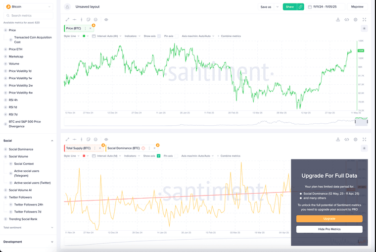
    For upselling, instead of blurring a full chart. Just blur the last 1-2 months, with a call to action for premium in the middle of the blur.
    Show Value >> Create pain >> Sell the pain.
    (See screenshot example of Santiment)

    image.png

    On top of your old design, there are so many cool improvements you can make.

    1. You could go the custom-built Santiment route (although I think that's not the highest priority)
    2. Make sure all charts are lined up cleanly. So you can quickly scroll up and down, build ideas and understanding between graphs (and all time frames align vertically)
    3. Premium users, you could let them put the charts in the order they like. OR you could let them save their last analysis (companies selected)
    Comments & Feedback resolved

  • Old UI was 100x better
    fredericvcF fredericvc

    Maybe this can inspire you.
    https://x.com/0xdesigner/status/1920912522296651839

    Keep things simple.

    • 1 page
    • Keep all the charts on the same page (the previous UI was incredible)
    • You can still blur some charts with a call to action to get Premium
    • You can still compare OR switch between BTC treasury companies.

    This requires little change (because you had it previously) and will 100x the value of your product.

    Comments & Feedback resolved

  • Old UI was 100x better
    fredericvcF fredericvc

    Can we please return to the Old UI, where all the charts were on one page?
    New UI is super frustrating, slows down each analysis.
    Don't change what is working.

    Comments & Feedback resolved
  • Login

  • Don't have an account? Register

Powered by NodeBB Contributors
  • First post
    Last post
0
  • Categories
  • Recent
  • Tags
  • Popular
  • World
  • Users
  • Groups